ViewPager cards inspired by "ViewPager cards inspired by Duolingo"

ViewPager cards inspired by Duolingo is a great post where the developer has tried to replicate the behavior of the viewpager and cards. I really liked the idea so I wanted to give it a try. I found this design quite interesting – Weather App UI - Dribbble and thought of giving it a try. You may notice that the previous and the next cards are partially visible and the distance between each card is uniform. To achieve this in Android, we need to dive in some Math.
To begin with, I just added some pageMargin and set pageWidth in PagerAdapter. This worked but I could not see the previous view as the viewpager will scroll till the current view has reached to the left most part of the viewpager. So I needed something which would also show the previous view. clipToPadding should be used for that.
There are some basic things that we should get familiarized with before diving into the math.
- To put some distance between each view in the viewpager, we need to use
pageMargin. - To show previous and next views in the viewpager, we need to use padding and make
clipToPaddingfalse. Read more aboutclipToPaddinghere.
I started working on some basic equations to get the desired result for all the screens. I got an equation with three different variables which would be very difficult to configure. So I dropped the idea of pageMargin and set it as 1. The view used in ViewPager will be match_parent so that it automatically takes the width of 1 page.
let
x1 = partial width of the previous view = partial width of the next view
x2 = distance between two pages = pageMargin
wp = width of the page
W = width of the screen
Pv = viewpager left padding = viewpager right padding
With simple width comparison we get,
2x1 + 2x2 + wp = W
To get the desired effect we need set to left and right padding to the viewpager and clipToPadding as false,
wp = W - 2Pv
Which gets us,
Pv = x1 + x2
We can set x1 and x2 based on our requirements.
With x1 = 16dp and x2 = 8dp, we get Pv = 24dp.
Let’s get some code here.
float density = getResources().getDisplayMetrics().density;
int partialWidth = 16 * density; // 16dp
int pageMargin = 8 * density; // 8dp

int viewPagerPadding = cardPartialShowWidth + pageMargin;

viewPager.setPageMargin(pageMargin);
viewPager.setPadding(viewPagerPadding, 0, viewPagerPadding, 0);
Well, this works now. We get the desired viewpager effect where we can see the preview and next views partially.

To make it like that dribbble design, we need to figure out a way where we can control the size and elevation of the view. I thought of using PagerTransformer as I know it would be the perfect tool to achieve the desired effect.
Transormation
void transformPage (View page, float position) gives us the view and the position.
position: Position of page relative to the current front-and-center position of the pager. 0 is front and center. 1 is one full page position to the right, and -1 is one page position to the left.
so basically, the position of the page at the left will be -1, the page at the right will be 1 and the page at the center will be 0. And it will change when the user swipes so it’s perfect to show some transformation effects.
transformPage changes scale and elevation linearly based on the position. So it was really easy to derive the equations.
baseElevation - Minimum elevation of the view
raisingElevation - Amount of elevation to be raised when the view is at center.
                   Elevation of view at center = baseElevation + raisingElevation
smallerScale - Y scale of the view when it is at position 1 or -1
So according to the equation,
position = 0 -> elevation = baseElevation + raisingElevation, scale = 1
position = 1 or -1 -> elevation = baseElevation, scale = smallerScale
position = 0.5 or -0.5 -> elevation = 0.5 * raisingElevation + baseElevation,
                          scale = smallerScale/2 + 0.5
This should work. Let’s see. Well, it did not work correctly. It does show the scale effect but I found an issue. I have changed the scale so that error can be seen easily.
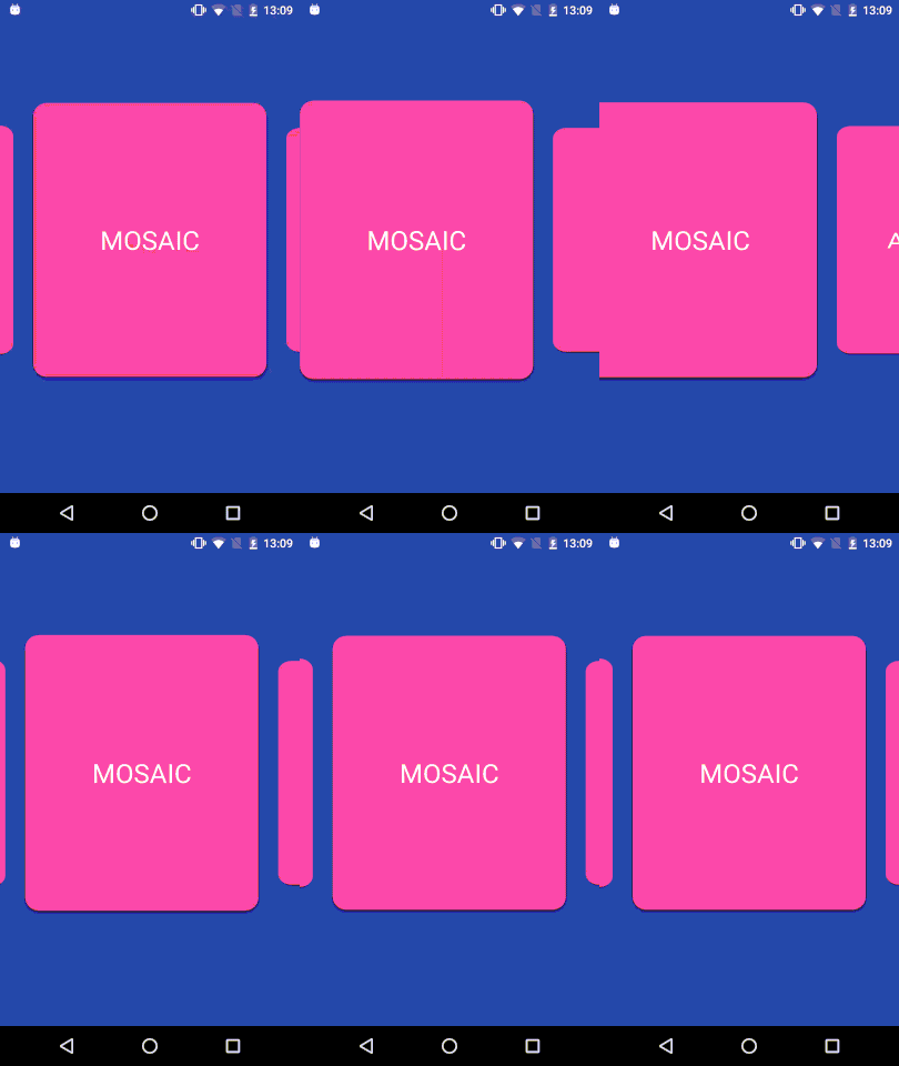
As you have noticed, the max scale is achieved when the view reached at the left side of the screen (which aslo means the left side of the viewpgaer). So as it turns out the center page does not have position 0. This could be due to the padding and setClipToPadding=false. When I logged the position, it turns out to be 0.10810811 on Nexus 5.
So maybe we need to change the equation and incorporate this constant value so that we acheieve the transformation effect correctly. Since it’s a linear equation, we can work with y = mx + c and I just need to find the slope and the constant.
Let’s assume that we figured out the offset value.
For elevation,
m = (baseElevation - raisingElevation)/(1-startOffset)
c = (raisingElevation - baseElevation * startOffset)/(1-startOffset)

elevation = (baseElevation - raisingElevation)/(1-startOffset) * absPosition +
            (raisingElevation - baseElevation * startOffset)/(1-startOffset);
For scale,
m = (smallerScale - 1)/(1 - startOffset)
c = (1 - smallerScale * startOffset)/(1 - startOffset)

scale = (smallerScale - 1)/(1 - startOffset) * absPosition +
        (1 - smallerScale * startOffset)/(1 - startOffset);
Well, that’s a bit complicated. But it should work. But wait, we can do a horizontal right shift and we’ll get the correct transformation equation.
y = f(x) + c

// shift
y = f(x - a) + c

// Initial equation
y = f(position) + c

// Modified equation
y = f(position - startOffset) + c;
Let’s calculate the offset.
ViewPager width = screen width = W
Width in which viewpager would draw the child = width - left padding - right padding = W - 2Pv
But since clipToPadding is false, it draws the child in W instead of W - 2Pv. This doesn’t affect the position of the page as it relative to the left of the viewpager.
ViewPage draws first view at x = Pv, and position 0 is at x = 0, so at x = Pv, the position should be left position/drawing width, which is
startOffset = Pv / (W - 2Pv)
Let’s get some code here.
Point screen = new Point();
getWindowManager().getDefaultDisplay().getSize(screen);
float startOffset = (float)(viewPagerPadding)/(float)(screen.x - 2*viewPagerPadding);

viewPager.setPageTransformer(false, new CardsPagerTransformer(baseElevation, raisingElevation, smallerScale, startOffset));
Let’s look at the results.

This looks good. Maybe a quadratic transformation might give better effects. But we could work with this. In the next post, I’ll work with enter and exit transitions of the viewpager and views to get good UI effects.
P.S. Working on this was quite refreshing. I’m looking forward to work on more UI elements.
Playing around with Android UI
Articles focusing on Android UI - playing around with ViewPagers, CoordinatorLayout, meaningful motions and animations, implementing difficult customized views, etc.
